So, it's been a few weeks since my last post. Whilst I've been painting here and there I've been struggling against the weather that seems hell bent on pushing past 40C as often as possible (that's 104F for anyone reading from the US).
Anyway, I've finished up Lady Eliza Farrow, highlighting her hair with a Gold Yellow:Moon Yellow mix, then pure Moon Yellow, and finally Moon Yellow:White mix. I also finished up the cup with bog-standard Gunmetal -> Chainmail -> Silver.
Finally, I ducked into Games Workshop and grabbed some wash (I just can't seem to get my homebrew to flow properly) and picked up some Blood For the Blood God from their technical range hoping it'd add a bit of depth to her blood trickle. Nope! I seriously can't tell the difference. Oh well, she's done now so nothing to complain about. I'll take some better photos later, but here she is complete:
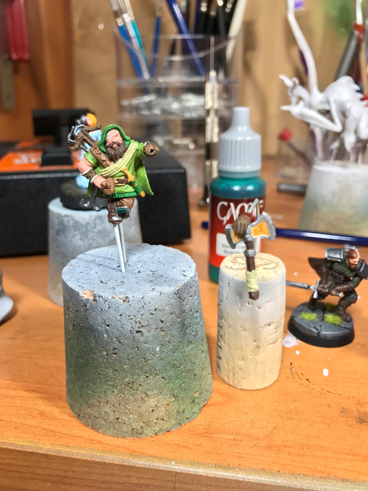
And on to Raythen, the hero version. One of my friends plays a Dwarf Ranger in our D&D campaign, so it was a pretty natural next choice.
So far I've managed to block out colours with a basecoat, so it'll be on to washes next. Here's the colour palette so far:
Cloak: VGA Goblin Green
Trim: VGC Mutation Green
Skin: 1 VGC Tan : 1 VMC Basic Skintone (3T)
Boot Guards: VGC Scurvy Green
Pouches & Pants: VMA Camo L. Brown
Rope & Axe Grip: VGA Dead Flesh
Gloves, Crossbow & Bracer: VMC Chocolate Brown
Beard, Belt, Boots & Axe Haft: VGA Charred Brown
Wrist Band: VMA Mahogony
Gold Trim: VGA Glorious Gold
Metal: VGA Chainmail Silver
As you can see from the photos below, lots of natural colours and quite a complex palette. Beyond blending the cape up to quite a light yellow-green, I'm planning to integrate most of the palette via a brown wash, but we'll have to see if it works.
Anyway, it's coming together and I'm quite pleased with the colour scheme. Will post again once he's had a thorough shading via washes. Until then, Happy Hobbying!
Monday, 30 January 2017
Eliza finished, on to Raythen
Labels:
Descent,
Finished,
Lady Eliza Farrow,
Lieutenant,
Painting,
Raythen (Hero),
WIP
Friday, 6 January 2017
WIP: Lady Eliza Farrow
Back again with an update, this time of Lady Eliza Farrow. She's been sitting on my work desk for almost a year with nothing but a primer coat on so I thought it was high time she got some paint on her.
There's not much to her, apart from a pretty bad sculpt - one hand is basically just a blob at the end of her sleeve, the other grasping the cup looks like her fingers are way too long, her nose melds with the cup where they meet, and where her hair falls on her neckline separating her dress from her face from behind, it's a solid wall of what looks like a mould line from the front.
Oh well, she still deserves a solid paint job. As you can see below, it's a work in progress, but I've focused all of my attention on her dress to start with. In the box art she's wearing what looks like a steel skirt, ranging from neutral grey shadows to white highlights. I looked around the internet for inspiration, and decided to go with a blue-shaded white dress instead as it looks prettier and presents a more pronounced contrast to the fact that she's drinking blood from a cup!
I wanted a very smooth blend from VMC Sky Blue to White, so I started with an airbrushed basecoat of VMC Sky Blue:
The skirt was then blended using lots and lots of very thin layers, as follows:
1) 2 VMC Sky Blue:1 VGA Deadwhite:3 Thinner
2) 1SB:1W:2T
3) 1SB:2W:3T
4) 1SB:4W:5T
5) 1SB:6W:7T
6) 1SB:12W:13T
Each colour was painted in between 4 to 7 layers, and whilst it took a while to see any real difference, the 4 hours of patience paid off. The ruffles were simply painted with the mix from step 6 above, minus the thinner to ensure it didn't flood the crevices.
Here's the final skirt:
Then I moved on to the skin. I found this significantly harder to blend well due to the cramped location and my lack of skill. My colour process was as follows:
Base) 2 VMC Basic Skintone:1 Thinner
Shade 1) 1 BS: 1 VMC Beige Red: 3 Thinner
Shade 2) 1 BR: 2 Thinner
Shade 3) 1 BR: 1 VMA Gold Brown: 3 Thinner
Shade 4) 1 Med. Camo Brown: 3 Thinner
At this point, I just couldn't get the shadows to work the way I wanted them to - the cleavage looked fine, but I really wanted to define a cheekbone line without being heavy handed. Anyway.
Highlight 1) 1 BS: 2 Thinner
Highlight 2) 1 BS: 1 VMC Light Flesh: 3 Thinner
I didn't really want to keep shading further as it just wasn't working for me, but I did want to add more of a pinkish tone to her skin, so I mixed up 2 Beige Red with 1 Scarlet Red (and 3 Thinner) and applied it almost as a shadow to her cheeks. Whaddayaknow, it did a much better job of defining the cheekbone and shading than my previous 4 layers! Still not perfect, but much better.
I added some VMA Ferrari Red to represent blood, and moved on to the hair.
So far, I've started with a VGA Bronze Fleshtone all over, then I mixed 1 VGA Gold Yellow with 2 Bad Moon Yellow and 2 Thinner and gave it a solid coat (the basecoat was really to get rid of the blue overspray from the air-brush). I've also now darkened it slightly with Citadel Gryphonne Sepia wash.
Finally, I've covered the cup in black followed by a dark base of VGA Gunmetal. Here's how she looks right now:
I'm really happy with how she's turned out so far, particularly the blend on the skirt. Next up I plan to blend from a mid-golden brown to a very light blond for the hair (hopefully blending individual strands to maintain definition between them), and finish the cup obviously.
Until then, Happy Hobbying!
There's not much to her, apart from a pretty bad sculpt - one hand is basically just a blob at the end of her sleeve, the other grasping the cup looks like her fingers are way too long, her nose melds with the cup where they meet, and where her hair falls on her neckline separating her dress from her face from behind, it's a solid wall of what looks like a mould line from the front.
Oh well, she still deserves a solid paint job. As you can see below, it's a work in progress, but I've focused all of my attention on her dress to start with. In the box art she's wearing what looks like a steel skirt, ranging from neutral grey shadows to white highlights. I looked around the internet for inspiration, and decided to go with a blue-shaded white dress instead as it looks prettier and presents a more pronounced contrast to the fact that she's drinking blood from a cup!
I wanted a very smooth blend from VMC Sky Blue to White, so I started with an airbrushed basecoat of VMC Sky Blue:
The skirt was then blended using lots and lots of very thin layers, as follows:
1) 2 VMC Sky Blue:1 VGA Deadwhite:3 Thinner
2) 1SB:1W:2T
3) 1SB:2W:3T
4) 1SB:4W:5T
5) 1SB:6W:7T
6) 1SB:12W:13T
Each colour was painted in between 4 to 7 layers, and whilst it took a while to see any real difference, the 4 hours of patience paid off. The ruffles were simply painted with the mix from step 6 above, minus the thinner to ensure it didn't flood the crevices.
Here's the final skirt:
Then I moved on to the skin. I found this significantly harder to blend well due to the cramped location and my lack of skill. My colour process was as follows:
Base) 2 VMC Basic Skintone:1 Thinner
Shade 1) 1 BS: 1 VMC Beige Red: 3 Thinner
Shade 2) 1 BR: 2 Thinner
Shade 3) 1 BR: 1 VMA Gold Brown: 3 Thinner
Shade 4) 1 Med. Camo Brown: 3 Thinner
At this point, I just couldn't get the shadows to work the way I wanted them to - the cleavage looked fine, but I really wanted to define a cheekbone line without being heavy handed. Anyway.
Highlight 1) 1 BS: 2 Thinner
Highlight 2) 1 BS: 1 VMC Light Flesh: 3 Thinner
I didn't really want to keep shading further as it just wasn't working for me, but I did want to add more of a pinkish tone to her skin, so I mixed up 2 Beige Red with 1 Scarlet Red (and 3 Thinner) and applied it almost as a shadow to her cheeks. Whaddayaknow, it did a much better job of defining the cheekbone and shading than my previous 4 layers! Still not perfect, but much better.
I added some VMA Ferrari Red to represent blood, and moved on to the hair.
So far, I've started with a VGA Bronze Fleshtone all over, then I mixed 1 VGA Gold Yellow with 2 Bad Moon Yellow and 2 Thinner and gave it a solid coat (the basecoat was really to get rid of the blue overspray from the air-brush). I've also now darkened it slightly with Citadel Gryphonne Sepia wash.
Finally, I've covered the cup in black followed by a dark base of VGA Gunmetal. Here's how she looks right now:
I'm really happy with how she's turned out so far, particularly the blend on the skirt. Next up I plan to blend from a mid-golden brown to a very light blond for the hair (hopefully blending individual strands to maintain definition between them), and finish the cup obviously.
Until then, Happy Hobbying!
Wednesday, 4 January 2017
The Queen is dead! Long live the Queen!
So, while I've been chipping away at Long, I've had Queen Ariad in her human form (so, technically just Ariad) staring at me in a sad, half-painted state. I had such grandiose plans for her!
The box art seems to intimate that her bodice is quite a red/brown at the top and fades to a darker purple as it progresses downwards. So, a long time ago when I had my airbrush out for something else, I smoothly transitioned from a 50:50 mix of Scarlett Red and Mahogony at the top through Hexed Lichen and finally Imperial Blue at the bottom. The blend was hellishly smooth (that's why I love the airbrush) and the top part looked fantastically warm and red and the bottom cold and blue/purple, but the middle colours always bothered me - they just looked...muddy.
Anyway, I continued regardless. To tie the bandages back into the rest of the mini, I basecoated them in a Hexed Lichen and Wolf Grey mix that produced a nice rich lavender colour (1:4 from memory), then drybrushed over it with Wolf Grey, and then Wolf Grey with a touch of white.
Then on to the gold - there's an extremely fine spiderweb pattern modelled into her bodice, so I set to carefully painting all of this pattern in Glorious Gold, along with her head and the backpiece. Except the modelled spiderweb was either moulded so delicately, or my airbrush painted over it too thick, so as to make it impossible for me to get a smooth gold line on most of the pattern that I could see. Or perhaps it was just a lack of skill.
Finally, I set to highlighting her dress/cloak. Unfortunately, as I had blended using the airbrush, trying to highlight an extremely fine series of folds required me to continuously blend a highlight colour. It just didn't work.
By this stage I was seriously unhappy with how it all looked, and I could feel it sucking my painting motivation out of me. I set the miniature down, took a photo, and walked away from it to clear my head. Sitting outside with a coffee, I looked at the photo (below), and saw this:
1) The bandages looked horrible (I hate how drybrushing looks most of the time, but this was worse than I've seen in a while)
2) The highlighting on the dress/cloak looked horrible. There was a bright blue streak on one section, but you could hardy tell the rest was even highlighted
3) The gold spiderweb was horrible! Nuff said
4) There were obvious mould lines everywhere; on her arms and legs especially. On finely detailed elements like the bandages I think this is inevitable to an extent, but the drybrushing really brought all this out and made it more obvious.
5) Perhaps worst of all, I hadn't really noticed how chunky the paint looked in sections. The gold backpiece and parts of her skirt had visible lumps on them, and the holes in the backpiece were irregular and poorly cut out.
I knew immediately there was no saving it. I've considered it a couple of times, but for the first time in 20-odd years of painting, I ordered another copy of the miniature. I could have repainted her, but my crappy prep and blobby paint just couldn't be fixed to a point I'd be satisfied. Better to start with a fresh copy and make brand new mistakes with that one.
I'm not quite up to binning the old copy yet - because I don't care anyway, I experimented with something I should have just done but didn't want to risk it; I cut the backpiece off. This confirms that when the new copy comes I can do the same and have a much easier time painting both it and her back. I'm also going to try painting the bandages in pure Wolf Grey, then washing with purple to see if I get a cleaner effect than drybrushing.
So, Queen Ariad is dead. But a new copy is on its way, and I'll move on to something fresh and new in the meantime.
I've got both Lady Eliza Farrow and two Merriods sitting on my desk ready to go - I plan to work on them in parallel, but I'll post progress separately soon. Until then, happy hobbying!
The box art seems to intimate that her bodice is quite a red/brown at the top and fades to a darker purple as it progresses downwards. So, a long time ago when I had my airbrush out for something else, I smoothly transitioned from a 50:50 mix of Scarlett Red and Mahogony at the top through Hexed Lichen and finally Imperial Blue at the bottom. The blend was hellishly smooth (that's why I love the airbrush) and the top part looked fantastically warm and red and the bottom cold and blue/purple, but the middle colours always bothered me - they just looked...muddy.
Anyway, I continued regardless. To tie the bandages back into the rest of the mini, I basecoated them in a Hexed Lichen and Wolf Grey mix that produced a nice rich lavender colour (1:4 from memory), then drybrushed over it with Wolf Grey, and then Wolf Grey with a touch of white.
Then on to the gold - there's an extremely fine spiderweb pattern modelled into her bodice, so I set to carefully painting all of this pattern in Glorious Gold, along with her head and the backpiece. Except the modelled spiderweb was either moulded so delicately, or my airbrush painted over it too thick, so as to make it impossible for me to get a smooth gold line on most of the pattern that I could see. Or perhaps it was just a lack of skill.
Finally, I set to highlighting her dress/cloak. Unfortunately, as I had blended using the airbrush, trying to highlight an extremely fine series of folds required me to continuously blend a highlight colour. It just didn't work.
By this stage I was seriously unhappy with how it all looked, and I could feel it sucking my painting motivation out of me. I set the miniature down, took a photo, and walked away from it to clear my head. Sitting outside with a coffee, I looked at the photo (below), and saw this:
1) The bandages looked horrible (I hate how drybrushing looks most of the time, but this was worse than I've seen in a while)
2) The highlighting on the dress/cloak looked horrible. There was a bright blue streak on one section, but you could hardy tell the rest was even highlighted
3) The gold spiderweb was horrible! Nuff said
4) There were obvious mould lines everywhere; on her arms and legs especially. On finely detailed elements like the bandages I think this is inevitable to an extent, but the drybrushing really brought all this out and made it more obvious.
5) Perhaps worst of all, I hadn't really noticed how chunky the paint looked in sections. The gold backpiece and parts of her skirt had visible lumps on them, and the holes in the backpiece were irregular and poorly cut out.
I knew immediately there was no saving it. I've considered it a couple of times, but for the first time in 20-odd years of painting, I ordered another copy of the miniature. I could have repainted her, but my crappy prep and blobby paint just couldn't be fixed to a point I'd be satisfied. Better to start with a fresh copy and make brand new mistakes with that one.
I'm not quite up to binning the old copy yet - because I don't care anyway, I experimented with something I should have just done but didn't want to risk it; I cut the backpiece off. This confirms that when the new copy comes I can do the same and have a much easier time painting both it and her back. I'm also going to try painting the bandages in pure Wolf Grey, then washing with purple to see if I get a cleaner effect than drybrushing.
So, Queen Ariad is dead. But a new copy is on its way, and I'll move on to something fresh and new in the meantime.
I've got both Lady Eliza Farrow and two Merriods sitting on my desk ready to go - I plan to work on them in parallel, but I'll post progress separately soon. Until then, happy hobbying!
Labels:
Ariad,
Descent,
Lady Eliza Farrow,
Lieutenant,
Painting,
WIP
Monday, 2 January 2017
It's been too Long!
So, it's been a couple of months since I last posted. For a nice change, that's not because I haven't been painting, though I did slow down due to the excruciating heat of Australian summer until I bought a portable air-con unit. It's made an absolutely huge difference, and I'm hoping that means painting won't have to be a winter-only hobby anymore as a result.
I haven't posted because I've been working on a secret project for one of my best friends to use in our D&D campaign.
After starting with a Dragonborn Barbarian, Big Dan decided his chosen personality wasn't quite washing well with the rest of the group, and since he'd been talking about inventing a Witcher class since we first started, we both decided it would be a perfect time to roll one up. Then we hatched a devious plan...we wouldn't tell the group what was going on until it unfolded in-game, so it'd be a complete surprise when his old character announced (at the grant old age of 4th level) that he was retiring from adventuring and staying in town. Needless to say, it was a shock to everyone, as was the poor NPC they'd been rescuing turning into Big Dan's new character. Loads of fun!
We wanted a miniature to represent the new Witcher character, and Big Dan wanted something pretty close to the characters from the novels and video games with the same names and preferably with a reference to wolves. Nothing from the Descent range suited, so we started searching online for something that would, and we quickly came across this:
Imperial Wolfbane Commandos from a science fiction game called Warzone Resurrection. Without making any promises of success, I quickly ordered them and set to converting the mini that most closely represented what we were looking for. It didn't take much - I simply cut off the designs on the chest and shoulders.
Now for some paint. Here's what I used:
Pants: 1 CG:1 B:2T, highlighted with CH
Chestplate and tunic: 1YO:1T, highlighted with successive additions of VMA BW
Cloak & Gloves: VMA BU, followed by 3BU:2CLB:3T, and finally CLB for extreme highlights
Belt & Boots: VMA CB followed by a drybrush of VMA BB
Face: VMC BR, then I kept added VMC BS until it was pure for highlight layers
Eyes: GY, edged with BMY
Wolf Pelt: For the wolf pelt, I wet blended bands of VGA DW, SWG, SG and B, from white where the wolf's underbelly would be through to black along its spine. I then highlighted with a light drybrush of SWG
Shoulders and Knee-guards: I started with a base coat of VMA DM, then lightly highlighted with VGA S.
Sword: Starting with a VGA CM base, I made two glazes to darken and highlight on opposite sides of the sword according to where I thought the light would fall, as follows:
- Shade: 1 VMA DM:2B:12 Glaze Medium
- Highlight: 1 VGA S:12 Glaze Medium
I then used these in about 10 coats each to slowly blend in the shadow and light.
Here's the final miniature, which I actually found the time to properly photograph for a change:
All in all I'm really happy with how he turned out. There's a few things that still bother me, which I may fix up at some point - his sword didn't come out the way I would have liked, and it's bent to boot (more on how to fix that in a future post). Looking at the photos, I need to check the wolf's eyes too - I don't remember it looking wrong on the mini, but the photo above makes it look like his upper eyelids and brow are yellow! I had also planned to paint his cloak using a VMA Mahogany base instead of Burnt Umber, but I mixed up the paint pots in one of many thin base coat layers and it was impossible to fix it without repriming the cloak. Oh well.
Anyhoo, was an interesting miniature to paint. I particularly liked how the wet-blend on the wolf pelt came out, along with the two-brush blend on the cloak and gloves.
Well that's it for now - I've got 4 more miniatures on my workbench right now, plus two more custom minis for my D&D crew, so expect more updates soon. Until then, happy hobbying!
Note: Unless otherwise specified, all paint is Vallejo Game Colour.
Paint codes used:
VGA - Vallejo Game Air
VGC - Vallejo Game Colour
VMA - Vallejo Model Air
VMC - Vallejo Model Colour
CG - Cold Grey
B - Black
YO - Yellow Olive
BW - Bonewhite
BU - Burnt Umber
CLB - Camo Light Brown
CB - Charred Brown
BB - Beasty Brown
BR - Beige Red
BS - Basic Skintone
GY - Golden Yellow
BMY - Bad Moon Yellow
DW - Dead White
SWG - Stonewall Grey
SG - Sombre Grey
CM - Chainmail
DM - Dark Metal
S - Silver
T - Thinner (10 Water : 1 Flow-Aid)
I haven't posted because I've been working on a secret project for one of my best friends to use in our D&D campaign.
After starting with a Dragonborn Barbarian, Big Dan decided his chosen personality wasn't quite washing well with the rest of the group, and since he'd been talking about inventing a Witcher class since we first started, we both decided it would be a perfect time to roll one up. Then we hatched a devious plan...we wouldn't tell the group what was going on until it unfolded in-game, so it'd be a complete surprise when his old character announced (at the grant old age of 4th level) that he was retiring from adventuring and staying in town. Needless to say, it was a shock to everyone, as was the poor NPC they'd been rescuing turning into Big Dan's new character. Loads of fun!
We wanted a miniature to represent the new Witcher character, and Big Dan wanted something pretty close to the characters from the novels and video games with the same names and preferably with a reference to wolves. Nothing from the Descent range suited, so we started searching online for something that would, and we quickly came across this:
Imperial Wolfbane Commandos from a science fiction game called Warzone Resurrection. Without making any promises of success, I quickly ordered them and set to converting the mini that most closely represented what we were looking for. It didn't take much - I simply cut off the designs on the chest and shoulders.
Now for some paint. Here's what I used:
Pants: 1 CG:1 B:2T, highlighted with CH
Chestplate and tunic: 1YO:1T, highlighted with successive additions of VMA BW
Cloak & Gloves: VMA BU, followed by 3BU:2CLB:3T, and finally CLB for extreme highlights
Belt & Boots: VMA CB followed by a drybrush of VMA BB
Face: VMC BR, then I kept added VMC BS until it was pure for highlight layers
Eyes: GY, edged with BMY
Wolf Pelt: For the wolf pelt, I wet blended bands of VGA DW, SWG, SG and B, from white where the wolf's underbelly would be through to black along its spine. I then highlighted with a light drybrush of SWG
Shoulders and Knee-guards: I started with a base coat of VMA DM, then lightly highlighted with VGA S.
Sword: Starting with a VGA CM base, I made two glazes to darken and highlight on opposite sides of the sword according to where I thought the light would fall, as follows:
- Shade: 1 VMA DM:2B:12 Glaze Medium
- Highlight: 1 VGA S:12 Glaze Medium
I then used these in about 10 coats each to slowly blend in the shadow and light.
Here's the final miniature, which I actually found the time to properly photograph for a change:
All in all I'm really happy with how he turned out. There's a few things that still bother me, which I may fix up at some point - his sword didn't come out the way I would have liked, and it's bent to boot (more on how to fix that in a future post). Looking at the photos, I need to check the wolf's eyes too - I don't remember it looking wrong on the mini, but the photo above makes it look like his upper eyelids and brow are yellow! I had also planned to paint his cloak using a VMA Mahogany base instead of Burnt Umber, but I mixed up the paint pots in one of many thin base coat layers and it was impossible to fix it without repriming the cloak. Oh well.
Anyhoo, was an interesting miniature to paint. I particularly liked how the wet-blend on the wolf pelt came out, along with the two-brush blend on the cloak and gloves.
Well that's it for now - I've got 4 more miniatures on my workbench right now, plus two more custom minis for my D&D crew, so expect more updates soon. Until then, happy hobbying!
Note: Unless otherwise specified, all paint is Vallejo Game Colour.
Paint codes used:
VGA - Vallejo Game Air
VGC - Vallejo Game Colour
VMA - Vallejo Model Air
VMC - Vallejo Model Colour
CG - Cold Grey
B - Black
YO - Yellow Olive
BW - Bonewhite
BU - Burnt Umber
CLB - Camo Light Brown
CB - Charred Brown
BB - Beasty Brown
BR - Beige Red
BS - Basic Skintone
GY - Golden Yellow
BMY - Bad Moon Yellow
DW - Dead White
SWG - Stonewall Grey
SG - Sombre Grey
CM - Chainmail
DM - Dark Metal
S - Silver
T - Thinner (10 Water : 1 Flow-Aid)
Tuesday, 4 October 2016
Trenloe Complete
Finally complete! It's been several weeks since my last update, but I haven't stopped painting in that time - unfortunately the advice I've read is to leave oil-based washes for 24-48 hours to dry before either re-washing or varnishing and moving on to the next stage. Because I've been super-busy with work, I usually only get time to paint on weekends, so that's meant I only get to paint one wash layer before packing up for the weekend. Very frustrating slowness, but the results are more than worth it.
So, from where we were at the last update, I washed the silver armour with Windsor & Newton black oil paint (heavily thinned with odorless methylated spirits), and the gold with Burnt Umber. This provided a fantastic effect on the brown but I struggled quite a lot with the black - the goal of using oil-based washes is it provided a much lower surface tension compared to water-based acrylics, so it flows much better over the miniature and tends not to leave tide-lines.
The problem is that is has a much lower surface tension and flows much better over the miniature, so I ended up getting it literally everywhere! Luckily, removing oil-based wash from a miniature once dry is as simple as wetting a clean brush with thinner and carefully brushing over areas you want to remove - it comes right off without leaving any staining at all on the layer beneath. This is why it's taken so long for me to finalise the miniature - I washed, touched up, washed, and re-touched up. So that's 4 x 48hours...
Anyway, once that was finished I edge-highlighted the silver and gold with the original Liquid Gold colours, and I spent a fair bit of time glazing the face as I really wasn't happy with how it was looking. To be honest, I'm still not happy with how it turned out, and it's likely the last time I'll be using the Vallejo Game Air range for flesh-tones again - Bronze Flesh is way too yellow and very difficult to bring warmth back to the overall tone. Probably just my lack of skill, but I think I'll stick to Vallejo Game Colour moving forward as they have a much nicer general Fleshtone colour to use as a base tone.
In the background, I've also spent some time mixing up my own acrylic washes. I frequently have issues using Vallejo's Game Colour Washes (I find them way too thick, and difficult to thin properly), and to be honest I really, really miss the old hex-pot based Citadel washes. Anyway, I've followed advice from Lester Bursley Miniatures and mixed Water (10 parts water : 1 part Liquitex Flow-Aid) and Matte Medium - 50:50, and then added various Daler Rowney acrylic-based inks to create a range of colours. My early tests with the final product are pretty promising but more on that as time progresses.
Here's my final pictures - still a bit messy, but very much keen to move on! Next up will be a bit of deviation from my normal Descent miniature painting, more on that in my next post. Until then, happy hobbying!
So, from where we were at the last update, I washed the silver armour with Windsor & Newton black oil paint (heavily thinned with odorless methylated spirits), and the gold with Burnt Umber. This provided a fantastic effect on the brown but I struggled quite a lot with the black - the goal of using oil-based washes is it provided a much lower surface tension compared to water-based acrylics, so it flows much better over the miniature and tends not to leave tide-lines.
The problem is that is has a much lower surface tension and flows much better over the miniature, so I ended up getting it literally everywhere! Luckily, removing oil-based wash from a miniature once dry is as simple as wetting a clean brush with thinner and carefully brushing over areas you want to remove - it comes right off without leaving any staining at all on the layer beneath. This is why it's taken so long for me to finalise the miniature - I washed, touched up, washed, and re-touched up. So that's 4 x 48hours...
Anyway, once that was finished I edge-highlighted the silver and gold with the original Liquid Gold colours, and I spent a fair bit of time glazing the face as I really wasn't happy with how it was looking. To be honest, I'm still not happy with how it turned out, and it's likely the last time I'll be using the Vallejo Game Air range for flesh-tones again - Bronze Flesh is way too yellow and very difficult to bring warmth back to the overall tone. Probably just my lack of skill, but I think I'll stick to Vallejo Game Colour moving forward as they have a much nicer general Fleshtone colour to use as a base tone.
In the background, I've also spent some time mixing up my own acrylic washes. I frequently have issues using Vallejo's Game Colour Washes (I find them way too thick, and difficult to thin properly), and to be honest I really, really miss the old hex-pot based Citadel washes. Anyway, I've followed advice from Lester Bursley Miniatures and mixed Water (10 parts water : 1 part Liquitex Flow-Aid) and Matte Medium - 50:50, and then added various Daler Rowney acrylic-based inks to create a range of colours. My early tests with the final product are pretty promising but more on that as time progresses.
Here's my final pictures - still a bit messy, but very much keen to move on! Next up will be a bit of deviation from my normal Descent miniature painting, more on that in my next post. Until then, happy hobbying!
Tuesday, 6 September 2016
Trenloe the...shiny?
I'll get the hobbying in just a mo, but I wanted to take a second on something else first, so please bear with me...
The reason I had some hobby time tonight is because my wife went out with her sister. They don't go out much together outside of pretty regular coffee catch ups, so that's pretty rare itself, but tonight they had the special honour of being asked to attend the opening night of My Fair Lady at the Opera House in Sydney. They were invited because their mother, Paddy Roberts, was a dancer in the original Australian production of My Fair Lady back in the 60's and toured the world with the show. Pretty amazing stuff. Unfortunately Paddy passed away a few years back after a pretty inspiring battle with cancer, but the revival production company (directed by none other than Julie Andrews herself) weren't aware so they sent Paddy tickets for herself + 1 in respect for her original performance, and then allowed my wife and her sister to attend on her behalf. My wife's on her way home so I'm sure she's full of stories and a blend of emotions, but just wanted to share this story with whoevers reading this as its a pretty amazing story; to us anyway.
So, as they say, on with the show! Back to Trenloe and my Frankensteinian experiments :)
Tonight I started by masking off the miniature so I could safely airbrush the shield. Now, I would advise way more patience than I displayed (I reckon I was lucky nothing went horribly wrong), but in short succession the shield received an airbrushing of Satin Varnish, then Chipping Medium, then Scarlett Red. After each coat I'd simply use the airbrush to spray pure air on the model for 10 minutes until it was dry to the touch. Like I said, I'm surprised I got away with it.
Here's the shield masked off and ready for chipping:
I then used a damp brush (a standard Kolinsky, which is surprising given I'd read I should use a stiff brush) to wet sections of the shield and slowly brush away the Scarlett paint, revealing the woodgrain underneath. I worked slowly and cautiously until I realised how hard it was to judge whether I'd removed enough red with all the masking, so I set to removing both the tape and the masking fluid. This brings me to the only minor issue I experienced all night - the masking fluid was an absolute fucking nightmare to remove! Now, granted I used a bottle that has been sitting on a shelf for a little over a year, so maybe it was way thicker than it should have been. I also wasn't masking a nice flat surface, it was detailed and curvey and quite complex. But I easily sat there with my toothpick and at a few stages a scalpel too, pulling away what had both the consistency and visual appeal of dirty snot! Sorry for the visual, but it's a direct correlation to my experience with this stuff. Painful. Slow. It probably took me longer than the 3 airbrush coats and chipping...oh well, lesson learned.
In the end I decided to leave the chipping where it was - it looks great and did exactly what I'd hoped, it really does look like the front of his shield was originally painted red, but years of battle has worn away the paint until only a hint remains on an otherwise bare wooden shield. I'm very pleased, and impressed with Vallejo's chipping medium (the newer, smaller bottle. No idea if it's the same as the old rebadged AK formula Vallejo still sell in the larger bottle). I'll go back in and hit the larger areas of Scarlett with a highlight in Blood Red, but other than that, the jobs' a goodun.
To finish off the night, I painted the shield and shoulder pad detail and his belt buckle in Vallejo's amazing Liquid Gold, this time in Old Gold. I also touched up some red overspray with Silver while I was at it. I really can't speak too highly of this paint - beyond feeling a little high from the fumes, it really does give an authentic "metal" look that I've never seen in a miniature-targeted paint. I had also planned to create some small highlights in Liquid Gold's "gold" colour, but alas I've been sent a bad bottle and it had coagulated in the bottom of the pot. I ran it in my Paint Shaker (brilliant little machine, that) for a full 10 minutes, and while I've found 30 seconds to be sufficient to properly mix a bottle of acrylic paint no matter how badly separated, this stuff was just way past saving. Oh well, I don't think it'll matter in the long run.
So, next up I'll seal the whole miniature in Satin Varnish, then I get to play with oil washes for the first time :) I've got to say, while I think I did a horrible job on his face, this miniature really does feel like it's coming together nicely - the colours all work well together and it certainly provides a strong contrast to Shiver who I painted before him. The experiments are also teaching me a great deal about new techniques too, so that's invaluable.
Anyway, I'll leave you with a couple of pictures of where he's at for now. Hopefully I can get back to him this weekend because the oil washes really will make a huge difference in terms of detailing. Until then, Happy Hobbying!
Sunday, 4 September 2016
Descent: I'm back baby!!! (again)
Wow, just over a year has passed since my last blogpost, and it feels horrible!
I've always been a sporadic painter, I'll hit it hard for 5 or 6 weeks and then can't seem to find the time. It's frustrating because it's absolutely the worst way to learn a skill - every time I take a break I come back rusty and have to relearn everything again. It's actually why I started this blog - it at least lets me document things like colour schemes and techniques I've tried and their success or failure. Unfortunately, I also live in a house where the study I paint in is closer to the sun than Mercury during summer, so I actually only have about 12 weeks of painting time left before it's not going to be possible due to the heat.
Anyway, enough waffle. Trenloe...I started him alongside Shiver and then shelved him to focus on more necromantic pursuits. So, time to get back to the shiny knight (and boy is he shiny!)
1) I started with the skirt:
a) 2 DY : 2 BB : 3T to shade and tone down the yellow tones
b) 2 DY : 2 ES : 1T for a first highlight
c) 2 DY : 6 ES : 2T for the final highlight
d) I edged the skirt with some thinned down VGC Brown Ink
2) The face was a bit of a nightmare. I'm still not all that pleased with it, but after two repaints I'm worried I'll start getting chalky build-up. Here's what I ended up with:
a) Pure ES base
b) Custom purple wash (see below) to shade
c) Re-base coat in pure ES
d) Highlight in 1:1 ES and PF
e) For the stubble, I used the ES/PF mix and added just a touch of CG. I thinned this heavily and slowly built up the hairline. I didn't think it was dark enough but I was scared if I went any darker it'd be way too dark so I've left it.
3) Belt, bags, red sash on skirt, weapon - all the little bits that needed to be done were pretty basic. BB on the bags and belt, CB on the weapon haft, SR on the skirt hem, and BW with a wash of VGC Brown Ink.
4) Silver, silver, everywhere! So, this was one of the two experiments I wanted to run on Trenloe - Vallejo's Liquid Gold paint range. This paint really is something else, and went way beyond my expectations - as you can see from the pics it's basically chrome in a can! The only downside to this amazing stuff is that it's thinned in alcohol instead of water, so I grabbed some 100% isopropyl alcohol from the local HW store and set to work. It has amazing coverage, it's easy to work with, and the results were fantastic. The only thing left to do on the armour is to wash it with black/brown, but that's for the next update.
5) The shield...so I wanted to do something a little different for Trenloe's shield. In the box art it looks like he has a wooden shield either covered in blood smears or red paint that has flaked off in battle. I've assumed the latter because a blood soaked shield just didn't make sense to me for this model. To that end I've decided to try using Vallejo's Chipping Medium to recreate the effect. This medium is supposed to be airbrushed onto a sealed colour coat, after which you paint on a different colour and then use a damp brush to "activate" the medium and remove sections of the second colour, exposing the original underneath. My idea is to paint a wooden shield, then airbrush it Scarlett and use the medium to remove most of the Scarlett coat in as natural a worn and chipped look as I can.
I've started with the wood (on both faces of the shield). I wanted something akin to ash wood, so I used a mix of 2 CG : 6 LB : 1T, and then carefully painted hair-thin squiggly lines in VGC Brown Ink to represent wood grain.
Not knowing if airbrushing the Chipping Medium onto the decorations on the shield would layer cause me issues with Liquid Gold (isopropyl is a pretty strong solvent after all), I thought it would be wise to also paint on some Vallejo masking fluid. Big mistake! This shit is horrible! It's very likely it's because I've had it sitting on the shelf for over a year but it was like adding a cup of water to playdough and trying to brush it onto the model! No idea if it will protect the model, or even come off later when I want it to, but there's not much I can do about it now /shrug
That's it for now. Here's some pics of where I've left it:
From here the plan is to finish the shield (varnish, Chipping Medium, Scarlett, then weather it back to the wood grain), remove the masking fluid on the shield and paint his belt buckle, shoulder pad, shield decoration and the two circles on his breastplate in Vallejo Liquid Gold, varnish the model and finally wash with oil-based washes.
Hopefully I'll get all that done without another 14 month break! Anyway, until them, Happy Hobbying!
Wednesday, 17 June 2015
Descent: Shiver Complete
As I suspected, I ended up focusing on one miniature more than the other. The outcome will be the same, but here's the process I followed for Shiver:
1) For the cloak I blended from the Ultramarine Blue (UB) basecoat down through 50:50 UB & Sombre Grey (SG), then pure SG, and finally 50:50 SG & Black. All the mixes are mixed in a ratio of 4 drops of paint to 2 Thinner and 1 Slow Dry.
I then applied a very slight highlight with 2 UB:3 Electric Blue (EB):3 T:1 SD. Shading for the blue sections was 50:50 Imperial Blue (IB) and EB, followed by pure IB. Shading for the grey sections was simply more and more Black added to a drop of SG, along with increasing amounts of thinner to avoid a pure black tone.
Finally I applied a highlight to the OSL via 2 EB and 4 T, followed by a very thin glaze of 2 EB and 4 White.
2) The central part of the cloak was basecoated in a mix of 2 Hexed Purple (HP) and 2 Warlord Purple (WP). Once dried I applied a mix of 2 WP and 2 Alien Purple (AP) to all surfaces but the recessed pattern. I finished up with a very light highlight of 4 AP + 1 WP on the edges.
3) The skin was a bit of a mess. I basecoated it in Dead Flesh but found that it was horribly yellow. I recoated in Bonewhite (BW), then shaded with VGC Sepia Ink which I note should never be diluted with Vallejo airbrush thinner. While the wash worked, it was extremely strong and stained the flat surfaces a lot more darkly than I had hoped. I recoated in BW, then highlighted in BW + White followed by BW + 2 White. I then glazed in a very thin mix of 1 VMA Pale Green, 1 BW and 10 drops of Glaze Medium before coating all of his skin. This gives just the slightest tint and makes him look sickly pallid rather than a skeleton.
I then painted his eyes in two shades of EB and White, and glazed a lighter tone onto his cheeks to represent eye-glow.
4) Finally I worked the metal parts.
The silver was undercoated in black, then gunmetal, silver and finally a wash of VMC Sepia Ink.
The gold was undercoated in Leather Brown, then Polished Gold and then also washed with Sepia Ink.
Anyway, that's Shiver down, Trenloe to go! Hopefully work doesn't stay as crazy as it has been and I'll have more time to paint over the next few weeks. Until then...happy hobbying.
~ Darchangel
1) For the cloak I blended from the Ultramarine Blue (UB) basecoat down through 50:50 UB & Sombre Grey (SG), then pure SG, and finally 50:50 SG & Black. All the mixes are mixed in a ratio of 4 drops of paint to 2 Thinner and 1 Slow Dry.
I then applied a very slight highlight with 2 UB:3 Electric Blue (EB):3 T:1 SD. Shading for the blue sections was 50:50 Imperial Blue (IB) and EB, followed by pure IB. Shading for the grey sections was simply more and more Black added to a drop of SG, along with increasing amounts of thinner to avoid a pure black tone.
Finally I applied a highlight to the OSL via 2 EB and 4 T, followed by a very thin glaze of 2 EB and 4 White.
2) The central part of the cloak was basecoated in a mix of 2 Hexed Purple (HP) and 2 Warlord Purple (WP). Once dried I applied a mix of 2 WP and 2 Alien Purple (AP) to all surfaces but the recessed pattern. I finished up with a very light highlight of 4 AP + 1 WP on the edges.
3) The skin was a bit of a mess. I basecoated it in Dead Flesh but found that it was horribly yellow. I recoated in Bonewhite (BW), then shaded with VGC Sepia Ink which I note should never be diluted with Vallejo airbrush thinner. While the wash worked, it was extremely strong and stained the flat surfaces a lot more darkly than I had hoped. I recoated in BW, then highlighted in BW + White followed by BW + 2 White. I then glazed in a very thin mix of 1 VMA Pale Green, 1 BW and 10 drops of Glaze Medium before coating all of his skin. This gives just the slightest tint and makes him look sickly pallid rather than a skeleton.
I then painted his eyes in two shades of EB and White, and glazed a lighter tone onto his cheeks to represent eye-glow.
4) Finally I worked the metal parts.
The silver was undercoated in black, then gunmetal, silver and finally a wash of VMC Sepia Ink.
The gold was undercoated in Leather Brown, then Polished Gold and then also washed with Sepia Ink.
Anyway, that's Shiver down, Trenloe to go! Hopefully work doesn't stay as crazy as it has been and I'll have more time to paint over the next few weeks. Until then...happy hobbying.
~ Darchangel
Saturday, 23 May 2015
Descent: Two-for-One
I couldn't decide between these two so I've started them simultaneously. I'm sure I'll end up focusing on one over the other as I progress, but I'm saving time for now.
Trenloe the Strong
Pretty simple start, just an airbrushed coat of Bronze Fleshtone over the grey primer for his skirt. I'll go back over it with a glaze of Leather Brown next as I really want to reproduce the rich mustard colour of the box art. Trenloe will also be treated to both silver and gold paints from the Vallejo Liquid Gold range, along with oil paint-based washes, so looking forward to that experiment. Here's the very humble beginnings:
Shiver
Up next is Shiver. I've done more on him only because there was more airbrush work required. I've airbrushed three colours here:
1) 50:50 Imperial Blue (IB) + Ultramarine Blue (UB) all over his cloak
2) Pure UB on roughly the top half of the cloak - I added thinner to keep this fairly subtle (about 20% thinner to 80% paint)
3) A very thin (3:1 thinner to paint) coat of Electric Blue (EB) on the side where his lantern is close to him
As you can see from the pics, the foundations for decent OSL are there, though it will look much better once his lantern isn't darker than the OSL.
Unfortunately throughout this process I discovered my Iwata HP-CS was jammed up from a poor cleaning last time I used it. It was actually so bad it refused to spray varnish on Belthir at all, so I had to strip it completely down and threw it in the Ultrasonic bath with about 30% Windex and the rest distillers water. Bit of a pain...
I was pleasantly surprised with the OSL section of the airbrushing though. By thinning the paint down so much I found I could set the PSI as low as 5-7, shoot extremely close to the miniature and just pull back on the trigger ever-so-slightly to get a very controlled flow without rivulets of paint jetting across the surface. Ok, that did happen at the start, but I cleaned it up with a wet brush and redid it ;)
Anyway, until next step Happy Hobbying!
~ Darchangel
Trenloe the Strong
Pretty simple start, just an airbrushed coat of Bronze Fleshtone over the grey primer for his skirt. I'll go back over it with a glaze of Leather Brown next as I really want to reproduce the rich mustard colour of the box art. Trenloe will also be treated to both silver and gold paints from the Vallejo Liquid Gold range, along with oil paint-based washes, so looking forward to that experiment. Here's the very humble beginnings:
Shiver
Up next is Shiver. I've done more on him only because there was more airbrush work required. I've airbrushed three colours here:
1) 50:50 Imperial Blue (IB) + Ultramarine Blue (UB) all over his cloak
2) Pure UB on roughly the top half of the cloak - I added thinner to keep this fairly subtle (about 20% thinner to 80% paint)
3) A very thin (3:1 thinner to paint) coat of Electric Blue (EB) on the side where his lantern is close to him
As you can see from the pics, the foundations for decent OSL are there, though it will look much better once his lantern isn't darker than the OSL.
Unfortunately throughout this process I discovered my Iwata HP-CS was jammed up from a poor cleaning last time I used it. It was actually so bad it refused to spray varnish on Belthir at all, so I had to strip it completely down and threw it in the Ultrasonic bath with about 30% Windex and the rest distillers water. Bit of a pain...
I was pleasantly surprised with the OSL section of the airbrushing though. By thinning the paint down so much I found I could set the PSI as low as 5-7, shoot extremely close to the miniature and just pull back on the trigger ever-so-slightly to get a very controlled flow without rivulets of paint jetting across the surface. Ok, that did happen at the start, but I cleaned it up with a wet brush and redid it ;)
Anyway, until next step Happy Hobbying!
~ Darchangel
Monday, 18 May 2015
Descent: Belthir Beaten!
Finally finished!! I've learnt a heap while painting him, but I'm keen to move on now.
So firstly I added a buttload of white to the final highlight colour and intended to paint a very fine line on the edges of the armour. Unfortunately they weren't nearly as fine as planned and now I'm a little angry with myself as its detracted from the overall effect. Not happy, but it'll have to do. C'est la vie.
Next I re-undercoated the weapon with Vallejo Grey Primer, using a rubber glove and some rubber bands as a mask for the rest of the miniature, and airbrushed the basecoat mix while I was at it.
His pants were painted black, belt and weapon haft with a 50:50 mix of Dark Fleshtone and Beasty Brown followed by straight Beasty Brown, and his loincloth was undercoated in 50:50 Black and Red Gore, based in Red Gore, then highlighted with Bloody Red, Hot Orange and Orange Fire.
I then proceeded to paint his weapon using the same process as his armour, but with the correct NNM highlights this time. The transitions weren't quite as smooth as the armour, but they're ok - clearly I need more practice in blending over a very small surface area.
Next up was a VGC Brown Ink wash for the weapon haft and belt, the weapon faces were finished in black and the pants were highlighted in a very dark mix of grey and black.
Finally, I mounted the wings, then painted and mounted his base before sealing everything in several coats of satin varnish. The base was painted with 50:50 Black and Cold Grey, before a heavy drybrush Cold Grey and a heavy wash of VGC Sepia Ink that was brushed away in patches before it completely dried to give it a dark dirty look.
Phew, I'm tired from just writing all that!
I've got a choice to make now - I have two heroes to paint, but each will require very different techniques. Shiver will require some airbrushing and a lot of traditional brushwork, but I'm planning on trying OSL for the first time on him as he's carrying a lantern. Trenloe the Strong should be much faster to finish, but I want to try my range of Vallejo Liquid metal paints for the first time necessitating the use of isopropyl alcohol as a thinner, and then wash using Oil Paints and Mineral Turpentine (which I've also never tried), so either way will expand my techniques. Guess you'll just have to stay tuned to find out who's up next! Until then, happy painting :)
Note: All paint is Vallejo Game Air unless otherwise noted.
~ Darchangel
Next I re-undercoated the weapon with Vallejo Grey Primer, using a rubber glove and some rubber bands as a mask for the rest of the miniature, and airbrushed the basecoat mix while I was at it.
His pants were painted black, belt and weapon haft with a 50:50 mix of Dark Fleshtone and Beasty Brown followed by straight Beasty Brown, and his loincloth was undercoated in 50:50 Black and Red Gore, based in Red Gore, then highlighted with Bloody Red, Hot Orange and Orange Fire.
I then proceeded to paint his weapon using the same process as his armour, but with the correct NNM highlights this time. The transitions weren't quite as smooth as the armour, but they're ok - clearly I need more practice in blending over a very small surface area.
Next up was a VGC Brown Ink wash for the weapon haft and belt, the weapon faces were finished in black and the pants were highlighted in a very dark mix of grey and black.
Finally, I mounted the wings, then painted and mounted his base before sealing everything in several coats of satin varnish. The base was painted with 50:50 Black and Cold Grey, before a heavy drybrush Cold Grey and a heavy wash of VGC Sepia Ink that was brushed away in patches before it completely dried to give it a dark dirty look.
Phew, I'm tired from just writing all that!
I've got a choice to make now - I have two heroes to paint, but each will require very different techniques. Shiver will require some airbrushing and a lot of traditional brushwork, but I'm planning on trying OSL for the first time on him as he's carrying a lantern. Trenloe the Strong should be much faster to finish, but I want to try my range of Vallejo Liquid metal paints for the first time necessitating the use of isopropyl alcohol as a thinner, and then wash using Oil Paints and Mineral Turpentine (which I've also never tried), so either way will expand my techniques. Guess you'll just have to stay tuned to find out who's up next! Until then, happy painting :)
Note: All paint is Vallejo Game Air unless otherwise noted.
~ Darchangel
Sunday, 10 May 2015
Final NNM
Well, the final coat is on and I'm declaring this little foray into NNM closed! (Though while writing this I've realised I forgot to add some highlights in the darkest areas. Bugger!)
Final stages:
7) 2nd Shade: 2DG:2IB:2T
8) Final Highlight: 2EG:2EB:4W:6T:2SD
All in all, I'm pretty happy with the result given this is my first attempt at NNM and 2-brush blending. I've learnt a crap load and I'm confident my next attempt will be even better. The one key learning I took away was that the base coat is so very important to get smooth. I really wish I'd spent the time to mask the red hide and then airbrush the base coat on the armour as it would have prevented the quite ugly build up I had to work around having put 3 base coats on. Amateur move, but you live, learn and move forward.
You might notice from the last photo that I've started reapplying undercoat to the weapon. I realised that I completely messed up the highlight locations and figured it'd be easier to start again that try to save it.
The next update should see Belthir finished: I just need to do the weapon, black leggings and his loin cloth in a nice warm red. Might be a few days before the next update as a result, we'll have to see :)
All paint is VGA. Colour codes are:
Dark Green = DG
Sick Green = SG
Escorpena Green = EG
Imperial Blue = IB
Magic Blue = MB
Electric Blue = EB
White = W
T = Vallejo Airbrush Thinner
SD = Liquitex Slow Dry
~ Darchangel
Final stages:
7) 2nd Shade: 2DG:2IB:2T
8) Final Highlight: 2EG:2EB:4W:6T:2SD
All in all, I'm pretty happy with the result given this is my first attempt at NNM and 2-brush blending. I've learnt a crap load and I'm confident my next attempt will be even better. The one key learning I took away was that the base coat is so very important to get smooth. I really wish I'd spent the time to mask the red hide and then airbrush the base coat on the armour as it would have prevented the quite ugly build up I had to work around having put 3 base coats on. Amateur move, but you live, learn and move forward.
You might notice from the last photo that I've started reapplying undercoat to the weapon. I realised that I completely messed up the highlight locations and figured it'd be easier to start again that try to save it.
The next update should see Belthir finished: I just need to do the weapon, black leggings and his loin cloth in a nice warm red. Might be a few days before the next update as a result, we'll have to see :)
All paint is VGA. Colour codes are:
Dark Green = DG
Sick Green = SG
Escorpena Green = EG
Imperial Blue = IB
Magic Blue = MB
Electric Blue = EB
White = W
T = Vallejo Airbrush Thinner
SD = Liquitex Slow Dry
~ Darchangel
Friday, 8 May 2015
NNM Part 3
The saga continues! Rather than go back in with the base colour, I decided to use the 1st highlight colour instead. I found this smoothed out the transitions a great deal and cleaned things up a fair bit. You might also notice that not only am I thinning more (due to what I learned from my last 2 highlights), but I've also introduced some Liquitex Slow Dry, just to ensure I get a bit more time to smooth transitions with a damp brush if I need to.
5) Re-highlight: 2SG:2MB:2T:1SD

6) 1st Shade: 2DG:1MB:1IB:2T:1SD

I'm starting to try to keep the photos consistent as it's easier to see the progress. All in all I'm very happy so far, the shading is really starting to pull everything together. I may actually go back in before I continue though, as I think the large chest piece on the right could do with darkening at the bottom.
All paint is VGA. Colour codes are:
Dark Green = DG
Sick Green = SG
Escorpena Green = EG
Imperial Blue = IB
Magic Blue = MB
Electric Blue = EB
T = Vallejo Airbrush Thinner
SD = Liquitex Slow Dry
~ Darchangel
5) Re-highlight: 2SG:2MB:2T:1SD

6) 1st Shade: 2DG:1MB:1IB:2T:1SD

I'm starting to try to keep the photos consistent as it's easier to see the progress. All in all I'm very happy so far, the shading is really starting to pull everything together. I may actually go back in before I continue though, as I think the large chest piece on the right could do with darkening at the bottom.
All paint is VGA. Colour codes are:
Dark Green = DG
Sick Green = SG
Escorpena Green = EG
Imperial Blue = IB
Magic Blue = MB
Electric Blue = EB
T = Vallejo Airbrush Thinner
SD = Liquitex Slow Dry
~ Darchangel
Thursday, 7 May 2015
NNM Part 2
Sorry for the sporadic posts - I save stuff up for a bigger post, then get to work and think "it's gonna be a while before I paint again, I may as well post what I have", and it always seems to be that night I get some more time to paint. Oh well.
So, I feel like I'm having a bit more success with smooth blends, and I'm at least seeing some results. I'm using a two-brush blending technique - essentially I hold a damp clean brush in my mouth, use the colour brush to apply some paint, then quickly feather it with the clean brush. Rinse, repeat.
While experimenting with this technique (which I'm preferring over wet-blending at the moment at it seems more suited to the tiny areas I'm working on), I'm refining as a I go.
I've found that increasing my thinner amount to the point that the paint is basically like skim milk is helping immensely with the blend, almost to the point of not even needing to feather with the second brush. I load up the brush with paint, draw the stroke from where I want the least amount of colour to where I want the most, and lift off. Where I start the stroke gets so little colour it's invisible, and where I end the stroke gets a pure new colour, with a smooth transition in between.
It's not perfect, and there's areas I want to go back over with the base coat, but I'm finding it terribly effective - you can mainly see it on the chest plate.
Anyway, I've applied the last two highlight layers for now, let me know what you think.
3) 2nd Highlight: 1SG:1MB:1EG:1EB:2T

4) 3rd Highlight: 2EG:2EB:3T

Next up is to clean up the transitions by reapplying the base colour, then the three layers of shading and defining the lines between the armour segments. Then another highlight, wash/glazes if necessary, and finally edge highlighting and hot-spots. Phew!
All paint is VGA. Colour codes are:
Dark Green = DG
Magic Blue = MB
T = Vallejo Airbrush Thinner
Sick Green = SG
Escorpena Green = EG
Electric Blue = EB
~ Darchangel
So, I feel like I'm having a bit more success with smooth blends, and I'm at least seeing some results. I'm using a two-brush blending technique - essentially I hold a damp clean brush in my mouth, use the colour brush to apply some paint, then quickly feather it with the clean brush. Rinse, repeat.
While experimenting with this technique (which I'm preferring over wet-blending at the moment at it seems more suited to the tiny areas I'm working on), I'm refining as a I go.
I've found that increasing my thinner amount to the point that the paint is basically like skim milk is helping immensely with the blend, almost to the point of not even needing to feather with the second brush. I load up the brush with paint, draw the stroke from where I want the least amount of colour to where I want the most, and lift off. Where I start the stroke gets so little colour it's invisible, and where I end the stroke gets a pure new colour, with a smooth transition in between.
It's not perfect, and there's areas I want to go back over with the base coat, but I'm finding it terribly effective - you can mainly see it on the chest plate.
Anyway, I've applied the last two highlight layers for now, let me know what you think.
3) 2nd Highlight: 1SG:1MB:1EG:1EB:2T

4) 3rd Highlight: 2EG:2EB:3T

Next up is to clean up the transitions by reapplying the base colour, then the three layers of shading and defining the lines between the armour segments. Then another highlight, wash/glazes if necessary, and finally edge highlighting and hot-spots. Phew!
All paint is VGA. Colour codes are:
Dark Green = DG
Magic Blue = MB
T = Vallejo Airbrush Thinner
Sick Green = SG
Escorpena Green = EG
Electric Blue = EB
~ Darchangel
NNMAAARGH!
Ok, so I'm off and started with the aqua armour for Belthir!
From the gate I've realised just how low coverage these colours are, and even applying a thin coat of the basecoat started to show brushstrokes on the model. Instead of cake things on, I've gone for several thin layers and have added a drop of Vallejo Airbrush Thinner to ensure I don't get too much paint build up. Even so, after 4 coats I started to see some surface deposits so I stopped there - I'm hoping subsequent layers smooth out any colour inconsistencies still present.
My results so far are as follows:
1) Basecoat = 2DG:2MB:1T x 3

2) 1st Highlight: 2SG:2MB:1T

As you can see, I haven't made much progress :( The first highlight is surprisingly subtle and I'm actually a bit worried I'm going to run out of space for the next layers, but we'll have to see.
That hasn't been all my hobby work lately though (to be honest, the painting has been disappointingly slow).
In the background I've started working on a foam-core insert for the Descent 2E core game box. I'm up to 6 expansions, 17 lieutenant packs and 3 Hero & Monster packs, and while that all comes with a metric shitload of tokens and cards and tiles, FFG give you absolutely no way to organise any of it. I've been keeping the tokens in a fishing tackle box, cards in card boxes (a total of 4 at present), miniatures in my glass display cabinet and map tiles in the original 5 game boxes. Completely impractical!
So, after searching the web and forums I decided to steal the brilliant idea from Esoteric Order of Gamers (Link) but design my own inserts to support an ever-growing collection of tokens and cards. Here's my Work in Progress of the first layer - it fits snugly in the original game box and stores all the cards from all expansions with room for growth as well as some of the less-used tokens. Next up will be a sub-layer to fill the gap on top of the Hero Cards, to store the rest of the tokens, dice and doors/portcullises/shrubberies. Finally, there will hopefully be room for a second whole layer above that to store the map tiles, but I may just build a multi-layer map storage insert for one of the larger expansion boxes so I can store all map tiles together.

Note the custom card dividers - they took longer to make than the insert has so far!
I'm also working on a storage solution for all the miniatures but that's a post for another day.
More updates coming soon.
Note:
All paint is VGA. Colour codes are: Dark Green = DG
Magic Blue = MB
T = Vallejo Airbrush Thinner
Sick Green = SG
Escorpena Green = EG
Electric Blue = EB
From the gate I've realised just how low coverage these colours are, and even applying a thin coat of the basecoat started to show brushstrokes on the model. Instead of cake things on, I've gone for several thin layers and have added a drop of Vallejo Airbrush Thinner to ensure I don't get too much paint build up. Even so, after 4 coats I started to see some surface deposits so I stopped there - I'm hoping subsequent layers smooth out any colour inconsistencies still present.
My results so far are as follows:
1) Basecoat = 2DG:2MB:1T x 3

2) 1st Highlight: 2SG:2MB:1T

As you can see, I haven't made much progress :( The first highlight is surprisingly subtle and I'm actually a bit worried I'm going to run out of space for the next layers, but we'll have to see.
That hasn't been all my hobby work lately though (to be honest, the painting has been disappointingly slow).
In the background I've started working on a foam-core insert for the Descent 2E core game box. I'm up to 6 expansions, 17 lieutenant packs and 3 Hero & Monster packs, and while that all comes with a metric shitload of tokens and cards and tiles, FFG give you absolutely no way to organise any of it. I've been keeping the tokens in a fishing tackle box, cards in card boxes (a total of 4 at present), miniatures in my glass display cabinet and map tiles in the original 5 game boxes. Completely impractical!
So, after searching the web and forums I decided to steal the brilliant idea from Esoteric Order of Gamers (Link) but design my own inserts to support an ever-growing collection of tokens and cards. Here's my Work in Progress of the first layer - it fits snugly in the original game box and stores all the cards from all expansions with room for growth as well as some of the less-used tokens. Next up will be a sub-layer to fill the gap on top of the Hero Cards, to store the rest of the tokens, dice and doors/portcullises/shrubberies. Finally, there will hopefully be room for a second whole layer above that to store the map tiles, but I may just build a multi-layer map storage insert for one of the larger expansion boxes so I can store all map tiles together.

Note the custom card dividers - they took longer to make than the insert has so far!
I'm also working on a storage solution for all the miniatures but that's a post for another day.
More updates coming soon.
Note:
All paint is VGA. Colour codes are: Dark Green = DG
Magic Blue = MB
T = Vallejo Airbrush Thinner
Sick Green = SG
Escorpena Green = EG
Electric Blue = EB
Labels:
Belthir,
Descent,
Foam-Core Insert,
Lieutenant,
Miniature Storage,
WIP
Wednesday, 29 April 2015
The brown covers the pink, sink the red?
I'm kinda pushing it with the titles, I know, but that's what comes from excitement.
After thinking about it and generally procrastinating most of the day, I spent about half an hour this afternoon fixing my pink issue with what ended up being quite a simple solution. I mixed up what I was planning to be a red/brown glaze and stopped at just a single drop of Scarlet Red and changed my mind. After watching some YouTube videos from Studio McVey on the two-brush blending technique recently, I thought I'd see if I could smooth the transitions out a bit using this method.
Boy did it work! Inspired, I then mixed up a dark brown glaze and went over the whole miniature to tone it all back down a bit, and I'm so pleased with the result. Using a second damp brush to take the fresh layer of paint away from the areas I wanted to keep highlighted, and to feather out the edge of the colour I was applying, the transitions were miles ahead in terms of smoothness.
I'm now ready to declare the hide finished. I'll do the horns and eyes later, but the actual hide is done. Here's where I'm at:


On to the armour, finally! Now originally I was planning on ignoring the box art (which depicts aqua armour), and just paint it blue instead. Beyond the fact that there's not a single aqua paint in the VGA lineup, I've got an awesome colour app on my phone that calculates complimentary colours and it tells me a soft mid-blue is a perfect match for the scarlet I've been using.
But meh, I love the box art and it's primarily because the aqua strikes such a balance with the scarlet. So I spent some time messing with my paints in the palette; the VGA line has three primary blues (dark, mid and light) and three primary greens (again, three tones), so I figured what the hell - maybe that'll give me three aquas to use. I wasn't quite right, but they certainly gave me some awesome tones to use.
Below is a picture of my palettes. The lighting really doesn't do the colours justice as they are more saturated and bright in real life, but you can see I've noted the mix for each.

So based on this, my plan is as follows:
1) Basecoat with a 1:1 mix of Dark Green (DG) to Magic Blue (MB)
2) Highlight with 1:1 Sick Green (SG) to MB
3) Highlight with 1:1 Escorpena Green (EG) to Electric Blue (EB)
4) Glaze with the basecoat mix to tone it back if I need to
5) Shade with 2:1:1 DG+MB+ Imperial Blue (IB)
6) Shade with 2:1:2 DG+MB+IB
7) Shade with 1:1 DG+IB
8) Final edge highlighting and hotspots with a lightened version of the EG+EB mix
I'll adjust as necessary throughout the process and I'm actually planning on doing mid-step mixes between highlighting and shading tones, so all up it should be 13 discreet paint mixes. If it makes sense at the time, I'll also add some very subtle red glazes to represent reflected colour from his arms and neck, but we'll have to see.
But before all that, I need to paint the glowing rune in his belt buckle. It's a really bright glowing rune in the box art, but it's a very fine embossed depression in the miniature so it's not going to be fun. Oh well, the means justify the end in this case :)
Until next time.
After thinking about it and generally procrastinating most of the day, I spent about half an hour this afternoon fixing my pink issue with what ended up being quite a simple solution. I mixed up what I was planning to be a red/brown glaze and stopped at just a single drop of Scarlet Red and changed my mind. After watching some YouTube videos from Studio McVey on the two-brush blending technique recently, I thought I'd see if I could smooth the transitions out a bit using this method.
Boy did it work! Inspired, I then mixed up a dark brown glaze and went over the whole miniature to tone it all back down a bit, and I'm so pleased with the result. Using a second damp brush to take the fresh layer of paint away from the areas I wanted to keep highlighted, and to feather out the edge of the colour I was applying, the transitions were miles ahead in terms of smoothness.
I'm now ready to declare the hide finished. I'll do the horns and eyes later, but the actual hide is done. Here's where I'm at:


On to the armour, finally! Now originally I was planning on ignoring the box art (which depicts aqua armour), and just paint it blue instead. Beyond the fact that there's not a single aqua paint in the VGA lineup, I've got an awesome colour app on my phone that calculates complimentary colours and it tells me a soft mid-blue is a perfect match for the scarlet I've been using.
But meh, I love the box art and it's primarily because the aqua strikes such a balance with the scarlet. So I spent some time messing with my paints in the palette; the VGA line has three primary blues (dark, mid and light) and three primary greens (again, three tones), so I figured what the hell - maybe that'll give me three aquas to use. I wasn't quite right, but they certainly gave me some awesome tones to use.
Below is a picture of my palettes. The lighting really doesn't do the colours justice as they are more saturated and bright in real life, but you can see I've noted the mix for each.

So based on this, my plan is as follows:
1) Basecoat with a 1:1 mix of Dark Green (DG) to Magic Blue (MB)
2) Highlight with 1:1 Sick Green (SG) to MB
3) Highlight with 1:1 Escorpena Green (EG) to Electric Blue (EB)
4) Glaze with the basecoat mix to tone it back if I need to
5) Shade with 2:1:1 DG+MB+ Imperial Blue (IB)
6) Shade with 2:1:2 DG+MB+IB
7) Shade with 1:1 DG+IB
8) Final edge highlighting and hotspots with a lightened version of the EG+EB mix
I'll adjust as necessary throughout the process and I'm actually planning on doing mid-step mixes between highlighting and shading tones, so all up it should be 13 discreet paint mixes. If it makes sense at the time, I'll also add some very subtle red glazes to represent reflected colour from his arms and neck, but we'll have to see.
But before all that, I need to paint the glowing rune in his belt buckle. It's a really bright glowing rune in the box art, but it's a very fine embossed depression in the miniature so it's not going to be fun. Oh well, the means justify the end in this case :)
Until next time.
Red's doing in my head!
And Pink stinks!
I've posted a couple of "completed" blog entries recetnly, but I'm going to start adding WIP blogs as and when I think there's a point. As in the old days on my blog, it'll be as much about formulating and documenting my process and experiments for myself as much as for anyone else to view (cuz hey, who's reading this but me anyway?!).
For the first WIP post, I'm currently working on Belthir, one of the lieutenants from Descent 2nd Edition. Nicely detailed model, reasonable scale (though a bit smaller than my usual GW space marines), and once I removed his wings he's reasonably easy to access with a paintbrush.
So the box art for Belthir has a frustrating amount of shadow over it, but it's pretty clear that he has a deep red hide and complimentary-coloured blue\green armour. I decided heading into painting him that I wanted to try my hand at NMM for the armour, so I figured I'd quickly paint the red hide so I didn't have to try to access his neck with a paintbrush later and get red paint on my finished armour. I also assumed the red would be relatively quick, and I'd spend most of my time on the armour. Boy was I wrong!
Painting a deep red and highlighting up without it appearing way too pink has proven to be a nightmare! I started with a VGA Scarlet Red basecoat, and a thin mix of Scarlet Red and Charred Brown for shading, then moved onto highlights. After experimenting with Bonewhite and finding it too pink, I settled on a Scarlet Red + Dwarf Flesh mix as it seemed to increase brightness without too much pinkness to it (on my test paper at least).
So, I've applied progressively smaller treatments of 2:1, 1:1 and 1:2 Scarlet Red to Dwarf Flesh, and as you can see from the pics below, there's quite a bit of not-cool going on:
I've posted a couple of "completed" blog entries recetnly, but I'm going to start adding WIP blogs as and when I think there's a point. As in the old days on my blog, it'll be as much about formulating and documenting my process and experiments for myself as much as for anyone else to view (cuz hey, who's reading this but me anyway?!).
For the first WIP post, I'm currently working on Belthir, one of the lieutenants from Descent 2nd Edition. Nicely detailed model, reasonable scale (though a bit smaller than my usual GW space marines), and once I removed his wings he's reasonably easy to access with a paintbrush.
So the box art for Belthir has a frustrating amount of shadow over it, but it's pretty clear that he has a deep red hide and complimentary-coloured blue\green armour. I decided heading into painting him that I wanted to try my hand at NMM for the armour, so I figured I'd quickly paint the red hide so I didn't have to try to access his neck with a paintbrush later and get red paint on my finished armour. I also assumed the red would be relatively quick, and I'd spend most of my time on the armour. Boy was I wrong!
Painting a deep red and highlighting up without it appearing way too pink has proven to be a nightmare! I started with a VGA Scarlet Red basecoat, and a thin mix of Scarlet Red and Charred Brown for shading, then moved onto highlights. After experimenting with Bonewhite and finding it too pink, I settled on a Scarlet Red + Dwarf Flesh mix as it seemed to increase brightness without too much pinkness to it (on my test paper at least).
So, I've applied progressively smaller treatments of 2:1, 1:1 and 1:2 Scarlet Red to Dwarf Flesh, and as you can see from the pics below, there's quite a bit of not-cool going on:
Firstly, I'm struggling to get smooth transitions. If I add a single drop of water to thin the mixed pain, I end up with something more like a wash - it fills recesses and pools on flat surfaces. If I don't add water, I'm finding it goes on way too thick to show the underlying layer and I don't get the blend I'm looking for.
Secondly, each successive colour is vastly different from the last, meaning I need to use much better blending techniques than I have so far.
Finally, it's freaking pink!!!
My plan at this stage is to bring the tone back down with several thin layers of a very dark brown (Black + Charred Brown + Glaze Medium) - this should restore the shadows and smooth out some of the layering. I may also apply a glaze of Scarlet Red if I find it ends up too desaturated. From there, I'll have to reassess next steps.
The figure only costs $10, so if I have to start again from basecoat I will, but I could just re-buy the whole miniature if I have to (though obviously I'd prefer not to). Hopefully I won't end up wet-blending the hide as well, as it's just further delaying this mini, and I have literally 160-odd left to do for Descent. Grrr....
Anyway, onwards and upwards :) Until next time - Darchangel
Subscribe to:
Posts (Atom)